One of the most valuable books I've ever read was "How to Lie with Statistics," by Darrell Huff. His main point is that statistics don't lie, if the numbers are accurate to begin with, but they can be used to distort reality.
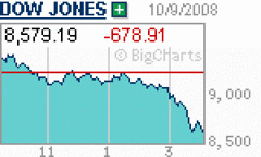
Consider this chart, which depicts yesterday's drop in the Dow Jones Industrials average. You might think the Dow dropped to near zero. This is a perfect example of what Huff calls a "gee whiz graph," because the Y-axis (the vertical axis) does not start at zero. It starts at 8,500 and goes to 9,500 (or maybe less), which exaggerates the graph line tremendously. The Dow fell big-time yesterday, but it did not go all the way to the bottom. It fell 7.33 percent. (This is a very common graph, such as you will find in virtually every publication with news of the stock market. There's no intent to mislead or deceive, but it definitely produces a "gee whiz" reaction.)
Now, if you have faith in this country and faith in the innate ability of Americans to overcome adversity, you ought to agree that this is not time to press the panic button. What goes down will go up, maybe not quickly and possibly not all the way back to the top, but the stock market will not form a crater upon impact with the bottom.

No comments:
Post a Comment